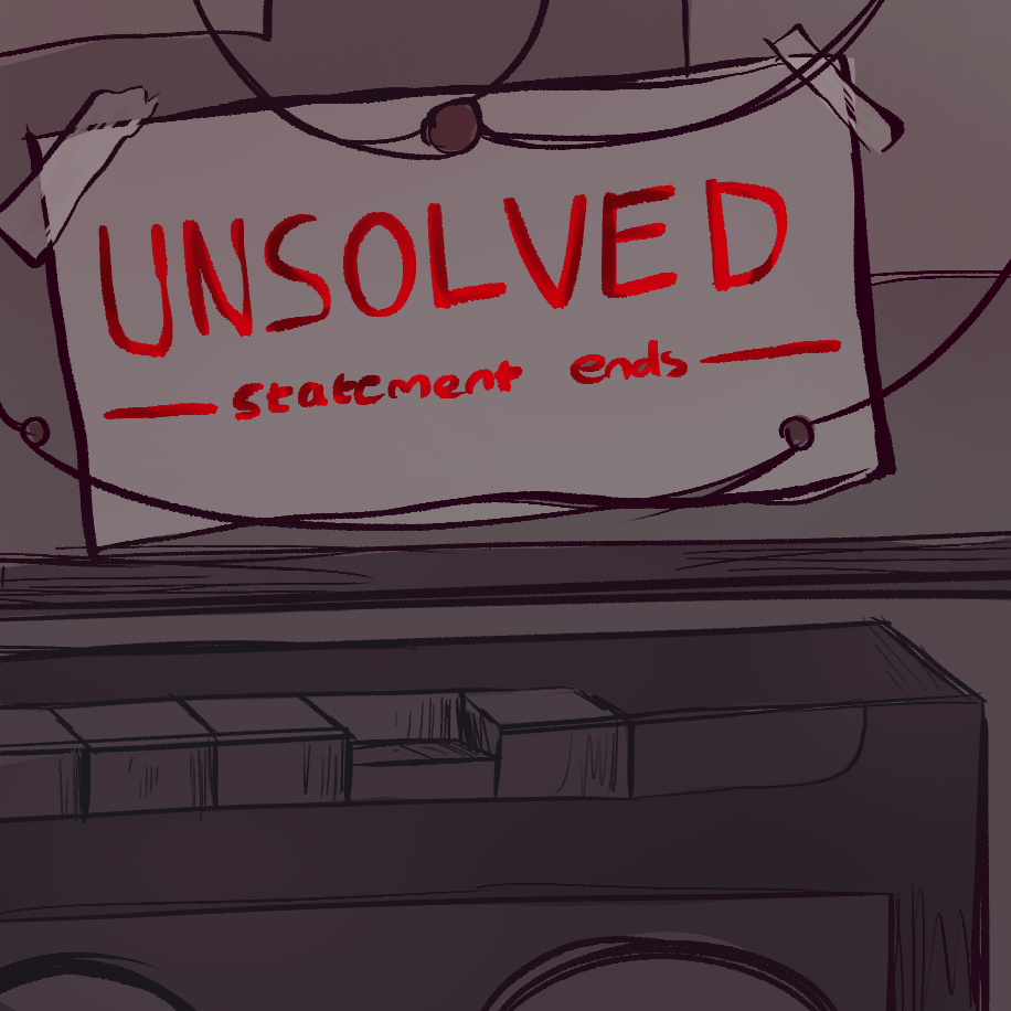
By me.
True crime has a shocking amount of podcasts and content. It seems to be a very common genre among the public. I decided to not only look at different thumbnails for true crime podcasts but also at YouTube thumbnails and book covers.
Podcasts
While scrolling through Spotify's true crime and horror genre, I picked out the thumbnails that looked interesting and could possibly fit into the police investigation old-timey recording atmosphere we have for our podcast.
I found that the majority of podcasts in the true/fictional crime genre have a very limited color palette. Only ever using less than three main colors. They're often desaturated and creepy using fonts and subtle codes like police tape, clippings, or the color red to signify blood.
The Magnus archives were a big inspiration when writing the script so I want to try to pay homage to it by having a tape recorder somewhere on the thumbnail. I'll be taking inspiration for Tinngal Nama's podcast as well due to the newspaper clippings and red string giving off the feeling of an ongoing investigation into something unsolved.
YouTube Videos
The one channel we took the most inspiration from was Buzzfeed Unsolved: True Crime. Many people adore this show and we wanted to capture the same atmosphere it had with how the retelling is executed.
Books
I did a quick google search on true crime books and found that similar to the podcasts the covers have a limited color with desaturated hues. The only color that's bright is the color red to signify blood or danger.
I found that since True Crime is already a very popular genre I'll have to stick to the elements that are already familiar to the public. The red being the only bright color, rough and rustic font, along with a desaturated and limited color palette.
Social Media
Social media for podcasts and YouTube shows often have the same thumbnail for both to be instantly recognizable. Along with a short description and a link to all other platforms and content
I made it look like it's a photo taken from Viena's desk. With the recording machine and the police board with the strings. A common visual for a person piecing a mystery together. I made everything monotone to give focus to the title.
NOTE:
My team mate Kanna made an amazing thumbnail and Instagram page for our podcast. We all agreed as a team to use her thumbnail and Instagram page. This is her blogger post about her development along with the link to the Instagram Page.
This next section was taken from her blog.
All of the fonts I used are from https://www.dafont.com/. I tried out 3 different sans serif and serif fonts for the unsolved logo. I tried out Adventuro Regular, MADE Avenue and Romelio Sans Regular. At the end I chose MADE Avenue because it looks versatile and classic. I enlarged the 'U' and 'D' and also made distort them into a curved shape to make the logo not look boring. I took inspirations from "You Must Remember Manson" podcast cover.
From Kanna's vlogFor the background I combined 3 pictures of black roses (which connotes death), The Black Dahlia and illustration of Jack the Ripper together. I then blend the collage with a dark reddish color and added noise to create an old school feel. However I later changed the background into a dark blue color to create a contrast between the background and the logo.
For the name of the production house I tested several fonts and after several discussions with my teammates we agreed that the font LEMON MILK (the first picture) looks the best because of its simplicity.
After creating the background and deciding on fonts the cover looked too plain and unappealing so I added an image of blood splatter and red strings (as a referent from police suspect boards).
This is our final podcast cover art:
software used: Adobe Photoshop
I uploaded several instagram stories to promote new episode of the podcast. I also put up a question and answer box for listeners to give their suggestion for the next case they want us to discuss to create prosumerism. Other than that i created a mini voting box for the audiences to vote on who they think is the real killer of The Black Dahlia case to make our contents more interactive for our audiences.
I organized the story posts I uploaded into several Instagram highlights. 'Welcome!' is for general informations regarding our podcast for new listeners, then I made highlights for each case so listeners can view the stories we uploaded even after 24 hours and so they can find them easily.


Comments
Post a Comment